A more comprehensive brand guide is available for AgriLife employees on the marketing and communications SharePoint site.
Our brand is the cumulative experience of every person we’ve reached. It reflects our vision and communicates who we are, what we do and how we do it. It’s a shared expression of the values that join four state agencies and one college together, and the collective mission that drives them forward. It’s a feeling evoked from the way we are seen and from the stories we tell. It’s the way Texas A&M AgriLife is recognized and remembered.
The Challenge
We are independent organizations with overlapping and sometimes disparate audiences and missions.
Together, we have the ability to come together to solve big, complex problems – to extend our reach beyond our own areas, to make a greater impact for the people we serve.
The Solution
Our brand is a rallying point. A tool for showing the outside world how Texas A&M AgriLife’s organizations, together, do greater work than any of its pieces alone.
- Our brand is a system of visual and verbal communication that ties us together and allows unique identities. Our brand is in your hands.
Identity Downloads
All AgriLife Identities can be found on the marketing and communications SharePoint site.
Business Cards and Stationery
Business card instructions and stationery downloads can be found on the marketing and communications SharePoint site.
Branded Merchandise
Trademark and licensing information can be found on the marketing and communications SharePoint site.
Texas A&M AgriLife Brand Relationships
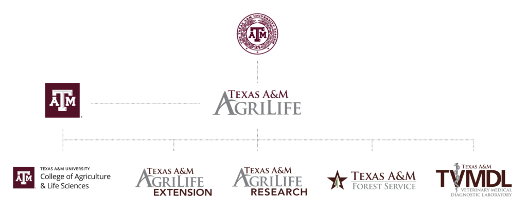
Texas A&M AgriLife is composed of the following members of The Texas A&M University System: Texas A&M AgriLife Extension Service, Texas A&M AgriLife Research, Texas A&M College of Agriculture and Life Sciences, Texas A&M Forest Service and Texas A&M Veterinary Medical Diagnostic Laboratory. The diagram below shows each member’s logo and relationship to Texas A&M AgriLife, Texas A&M University and the Texas A&M University System.
Usage
The Texas A&M AgriLife logo is used by the vice chancellor’s office, professional service units and on works that are a collaboration between two or more of the five main operational units.
Color
Besides consistent use of logos, another unifying visual component for our brand is consistent use of color. The Texas A&M AgriLife color palette was created to complement the Texas A&M University signature color, Aggie Maroon.
The official colors for Texas A&M AgriLife and Texas A&M University are Aggie Maroon and White. While secondary colors are available, they should
remain secondary.
Download Print and Digital Adobe Color Palettes
Color Palette
The colors below are for printed materials. Both Pantone spot colors and CMYK percentages have been provided. Every print technique is different and print proofs may be required to ensure color accuracy.
Maroon
Pantone 7421
HEX #500000
RGB 80, 0, 0
CMYK 15, 100, 39, 69
Dark Blue
Pantone 2965
HEX #02233b
RGB 2, 35, 59
CMYK 100/63/16/78
Dark Gray
Pantone 7C
HEX #333333
RGB 51, 51, 51
CMYK 67, 63, 63, 57
Light Gray
HEX #f6f6f6
RGB 246, 246, 246
CMYK 0, 0, 0, 4
Accent Colors (to be used sparingly)
HEX E4002B
RGB 228, 0, 43
HEX 27A9E1
RGB 39, 169, 225
HEX FCE300
RGB 252, 227, 0
Adobe Creative Cloud Users
Adobe CC users should follow the AgriLife Brand Libraries to ensure that you have the latest logos, colors, design elements and text styles available for use across all of your Adobe products.
The AgriLife Brand Library features the logos for each top level agency as well as the 4H clover, brand colors, text styles, and select design elements.
The Texas A&M College of Agriculture and Life Sciences Library features the College and department logos, brand colors, text styles, and design elements.
Feeling sophisticated? Check out this Adobe Libraries add-in for Microsoft Word and PowerPoint.
Additional Colors
A more comprehensive guide to color can be found on the Marketing and Communications SharePoint site.
Typography
Typography is the visual identity of messaging. Typography creates a cohesive, visually attractive and effective experience for the reader. There are four primary typefaces used in the Texas A&M AgriLife brand: Oswald, Open Sans and Minion.
Oswald
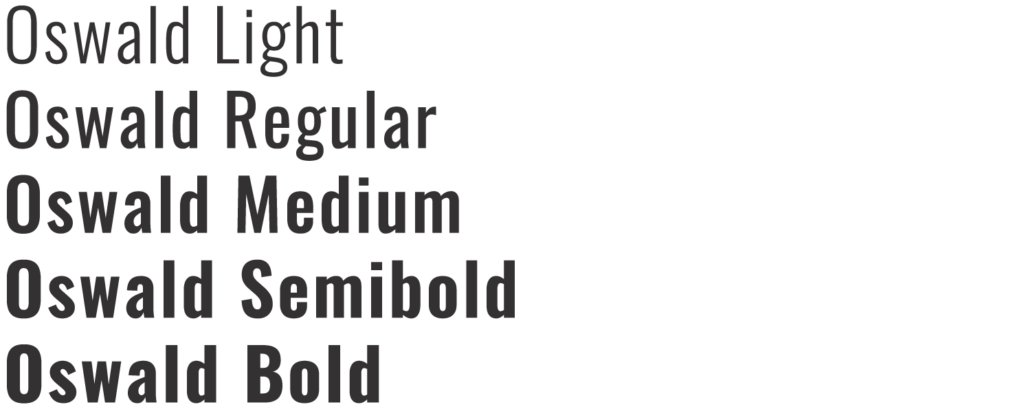
Oswald is a versatile sans serif font.
Use it predominantly for headlines
and titles.
Oswald is available for free through fonts.google.com
All caps may be used only when there are fewer than 10 words in a heading.
Never use all caps for full sentences or for subheadings.
Never use Oswald for body copy. It is too condensed and hard to read.
Leading: 110% font size
Tracking: Use at least 40
Minion
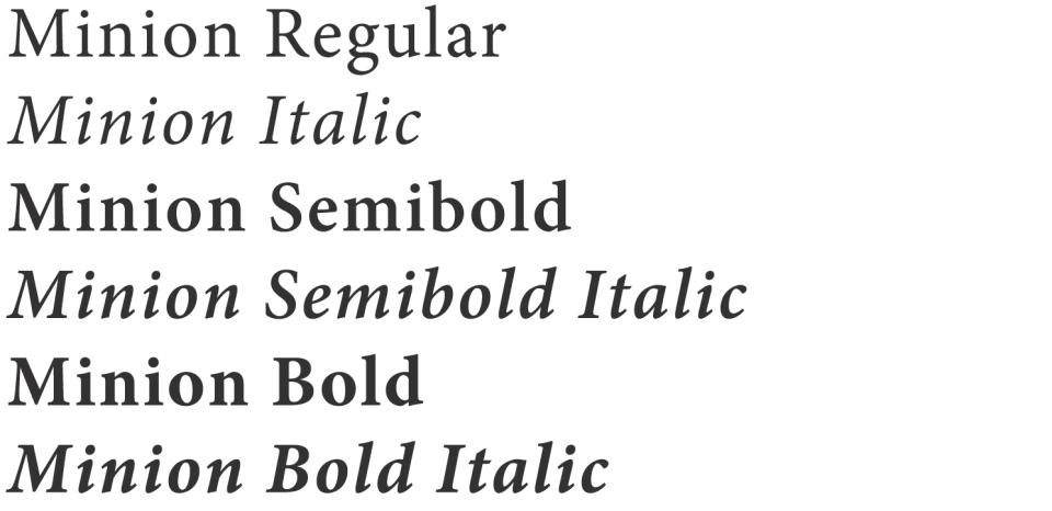
Minion is a serif style font that is excellent for formal events or multi-page documents.
If Minion is not available, Crimson can be used in its place.
All caps may be used only when there are fewer than 10 words in a heading.
Never use all caps for full sentences or for subheadings.
You may use Minion for body copy.
Leading: 110% font size
Tracking: 0
Open Sans
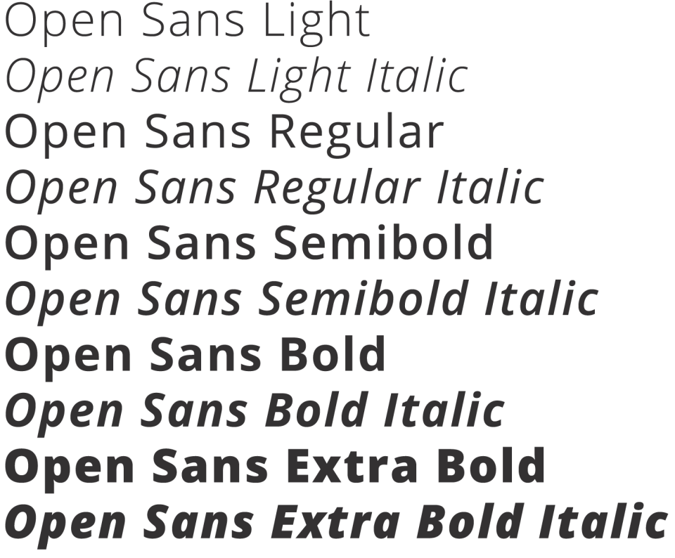
Open San is a clean, widely compatible web-font that works well in digital or print applications.
Open Sans is available for free through fonts.google.com
All caps may be used only when there are fewer than 10 words in a heading.
Never use all caps for full sentences or for subheadings.
You may use Open Sans for body copy.
Leading: 110% font size
Tracking: 0
A more comprehensive guide to typography can be found on the Marketing and Communications SharePoint site.
Logo Usage
Use the exact logo design you’ve downloaded. Please do not:

- Distort, modify or remove elements from the official logo
- Create your own logo, use incorrect colors or add elements to the official logos.
- Separate, reposition or delete parts of the logo
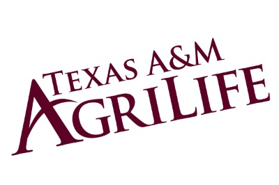
- Rotate the logo
- Use colors other than those approved
- Stretch or distort the proportions of a logo
Minimum Logo Sizes
When used in printed materials, the logo must be no smaller than 0.75 inches tall.
+ Digital
In web applications and on screens, the logo should not appear smaller than 30px in height.
When a logo must be resized, be careful to make sure that the proportions are maintained—this can often be accomplished by holding down the Shift key as you drag a corner of the image box.
Clear Space
The space around the logo or unit identity should always be kept clear of other elements (i.e., text, images or complicated backgrounds). This “clear space” is necessary to provide breathing room around the logo and should be at least 0.25″ around all sides. This margin should be similar in size to the “T” in “Texas A&M” and applies to all logos and unit Identities.


TEXAS A&M AGRILIFE LOGO — WHITE
+ Usage
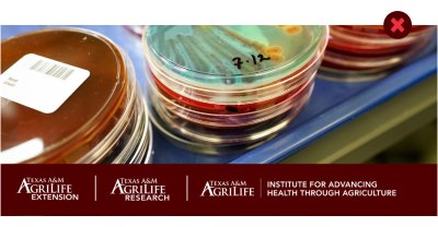
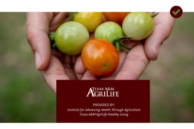
Use the all white version of the logo when there is a dark background. Acceptable solid colored backgrounds include Texas A&M AgriLife’s maroon, dark blue and dark gray.
It is acceptable to use the white logo on top of photographs as long as there is still a strong contrast and the logo is clearly recognizable.
TEXAS A&M AGRILIFE LOGO — FULL COLOR
+ Usage
The full color version works best on white or Texas A&M AgriLife’s light gray.
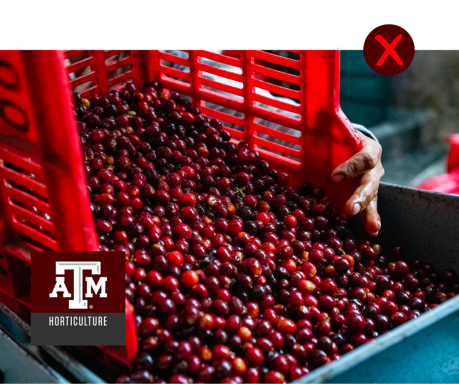
It is rarely acceptable to use the logo on top of photographs as there is rarely enough contrast between the photo and the logo.
Texas A&M AgriLife Elevation
Some publications require identification for multiple entities, including divisions, colleges, departments, offices, institutes or programs. In these applications, multiple unit identifiers clutter space and diminish recognition to the involved groups.
If applicable, the entity names should be listed within the document text.
Shirt Embroidery
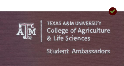
For those groups that need unit identification embroidered on a shirt but don’t have an official unit identity of their own, it is acceptable to use the unit identity of their respective department with their unit name written underneath.
This setup works well for groups like programs, labs, administrative services, Student Ambassadors and other student organizations that don’t have their own unit identity.
+ Usage
The name of the unit being identified should be written out using the Open Sans font, leaving a space between the respective logo or unit identity above and the unit name below.
TEXAS A&M AGRILIFE LOGO — MISUSE
Additional branding guidelines can be found on the marketing and communications SharePoint site.
Understanding File Types

PDF/EPS
Best uses: with a professional design program such as InDesign; when sending a logo to a designer or a print vendor — especially vendors using the logo on items such as t-shirts
Pro: transparent and scalable, it can be printed as large as you need
Con: larger file sizes

PNG
Best uses: web/digital
Pro: transparent background
Con: larger file size than .jpg in some cases; image will become pixelated if enlarged

JPG
Best uses: websites and printed materials
Pro: relatively small file size helps web pages load faster
Con: white background; image will become pixelated if enlarged
Frequently Asked Questions
Can I use the AgriLife logo if I’m joint appointed?
Yes.
What do I do with the old logo?
Do not use any previous version of the logo on any new collateral, flyer or branded item. Any use of older logos takes away from growing and strengthening our brand. Except for a few situations where replacing collateral is not cost effective—such as agency decals on vehicles—signage, collateral and communication pieces should reflect the correct Texas A&M AgriLife logo. Use of materials with any old logos should be discontinued.
Contact the Creative Services Team
Reach out to the Texas A&M AgriLife Marketing and Communications creative services team directly for specific branding, multimedia, and web questions.
Visit our Work With Us page for project requests.
Elisabeth Button
Assistant Director – Web Experience
[email protected]
Sam Craft
Associate Director – Visual Media
[email protected]
